Daha önceleri buna benzer bir JavaScript kütüphanesi paylaşmıştım sizlerle. Impress.js kütüphanesi ile jQuery kullanmadan klavye yön tuşlare ve boşluk tuşlarını kullanarak hareket eden görsel efektler kullanabiliyorsunuz. jQuery ZooMooz eklentisi de sayfa efektleri bakımından Impress ile benzer özelliklere sahip ama daha gelişmiş örnekleri de bulunuyor.
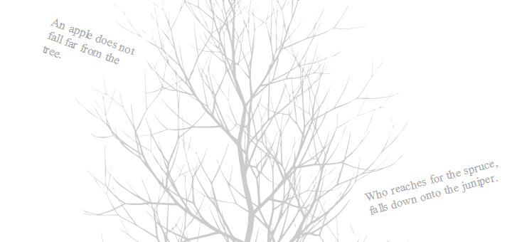
Svg formatında hazırlanmış bir ağaç düşünün ve bu ağacın her bir dalında farklı başlıklar olsun, bu başlıklara tıklandığında da yazı düz bir görünüm alıp yaklaşsın ve tekrar tıklandığında ağaç eski konumuna dönerek uzaklaşsın. Böyle uçuk bir animasyonu bile yapabilecek türden bir efektleri bulunuyor. Toplamda 3 tane demosu var ve SVG formatı sadece birincisiydi.
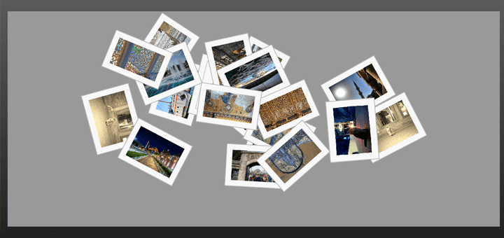
İkinci demosu Flickr sitesinden resimler çekebilen ve bu resimlerle sayfanın döndürülmesini sağlayan efektlere sahip. Demo sayfasında arama yapmanız için bir input alanı bulunuyor ve hemen altında da arama sonuçlarının gösterileceği bir çerçeve bulunuyor. Herhangi bir kelime yazıp enter tuşuna bastıktan sonra çerçeve yakınlaşıyor ve aradığınız kelime ile eşleşen resimler üst üste yığılmış ve her biri farklı derecede döndürülmüş bir şekilde görünüyorlar. Düz olmayan resimlere tıkladığınızda resmin kendisi düzelmiyor, pozisyonu aynı şekilde kalıyor ama herhangi bir resme tıkladığınızda web sayfası tamamen dönerek, resmin düz görünmesini sağlayıp daha da yakınlaşıyorlar. Bu da çok uçuk bir örnek. Düşünsenize resmi düzgün göstermek için bütün web sayfası dönüyor 🙂
Üçüncü ve son örneğimiz de 3D küp şeklinde bir görünüme sahip ve her küp çerçevesi içinde tıklanılabilir dört tane başlık ve konu bulunuyor. Tıklamış olduğunuz her konu çerçevesi yakınlaşıp ekranın tam ortasında görünüyor. Tabi bu yakınlaşma sırasında da küp yerinde durmuyor o da dönüyor. Janne Aukia gerçekten çok faydalı bir uygulama geliştirmiş. Benzerleri de pek bulunmayan bir uygulamadır. Bu yüzden kesinlikle arşivinizden eksik etmemeniz gerektiğini düşünüyorum.

Kullanım
- Head etiketleri arasına eklemeniz gereken bölümler.
Js Dosya adresleri :
<script src="https://ajax.googleapis.com/ajax/libs/jquery/1.7.1/jquery.min.js" type="text/javascript"></script>
<script type="text/javascript" src="jquery.zoomooz.min.js"></script>
- Flickr Demosu
Stil kodları :
 img, body {
 	 -webkit-user-select:none;
     -moz-user-select:none;
 }

 img {
	 border:1px solid #aaa;
	 padding:10px;
	 margin:5px;
	 background-color:#f8f8f8;
	 position:absolute;
 }

 body {
	 padding:0px;
	 background: rgb(94,94,94);
	 background: -webkit-gradient(linear, left top, left bottom, color-stop(1, rgb(30,30,30)), color-stop(0, rgb(94,94,94)));
	 background: -moz-linear-gradient(center top,rgb(30,30,30) 100%,rgb(94,94,94) 0%);
 }

 body, html {
     color:white;
     font-family: Helvetica Neue, Helvetica, sans-serif;
     line-height:32px;
     width:100%;
     height:100%;
     margin:0;
     padding:0;
 }

 a {
 	color: white;
 }

 #searchtext {
     height:30px;
     width:300px;
     font-size:20px;
     line-height:32px;
 }

 #container {
     position: absolute;
     left:200px;
     top:100px;
     right:200px;
     bottom:100px;
 }

 #output {
     position:absolute;
     background-color: #999;
     bottom:0px;
     left:0;
     top:100px;
     right:0;
     overflow:hidden;
 }

 #info, #info a {
	 color: #999;
 }

 #info {
     position:absolute;
	 left:0;
	 bottom:-30px;
	 height:30px;
}

 label {
     padding-right:10px;
 }
JavaScript :
<script type="text/javascript">
$(document).ready(function () {
    $.zoomooz.setup({
        duration: 1000,
        nativeanimation: true
    });

    $(document).keypress(function (evt) {
        if (evt.keyCode == 13) loadImages(true);
    });
    $("#searchtext").blur(function (evt) {
        loadImages(false);
    });

    var searchText = getUrlVars()["q"];
    if (searchText) {
        $("#searchtext").val(searchText);
        loadImages(false);
        $("body").zoomTo({
            targetsize: 1.0
        });
    }
});

var previousSearchString = "";
var notLoaded = true;

// from: https://jquery-howto.blogspot.com/2009/09/get-url-parameters-values-with-jquery.html
function getUrlVars() {
    var vars = [];

    var hash;
    var hashes = window.location.href.slice(window.location.href.indexOf('?') + 1).split('&');

    for (var i = 0; i < hashes.length; i++) {
        hash = hashes[i].split('=');
        vars.push(hash[0]);
        vars[hash[0]] = hash[1];
    }

    return vars;
}

function loadImages(forceImages) {
    var searchString = $("#searchtext").val();
    if (searchString == "") return;
    if (!forceImages && searchString == previousSearchString) return;
    previousSearchString = searchString;

    if (notLoaded) {
        notLoaded = false;

        $(window).click(function (evt) {
            evt.stopPropagation();
            $("body").zoomTo({
                targetsize: 1.0
            });
            $("#searchtext").focus();
        });
        $("body").zoomTo({
            targetsize: 1.0
        });
        $("#searchtext").focus();

        $("#output").click(function (evt) {
            evt.stopPropagation();
            $(this).zoomTo({
                targetsize: 0.97
            });
        });
    }

    var path = "https://api.flickr.com/services/feeds/photos_public.gne";
    var params = "?tags=" + searchString + "&tagmode=any&format=json&jsoncallback=?";
    $("#output").text("");
    $("#output").zoomTo({
        targetsize: 0.97
    });
    $.getJSON(path + params, function (data) {
        $.each(data.items, function (i, item) {
            var elem = $("<img/>");
            var smallimg = item.media.m;
            var fullimg = smallimg.replace("_m", "");
            elem.attr("src", fullimg);
            var parentElem = $("#output");

            var rot = "rotate(" + (Math.random() * 2 - 1) * 180 + "deg)";

            var margin = 20;
            var width = 10;
            var left = margin + Math.round(Math.random() * (100 - 2 * margin - width)) + "%";
            var top = margin + Math.round(Math.random() * (100 - 2 * margin - width)) + "%";
            var cssAttr = {
                "left": left,
                "top": top,
                "width": width + "%",
                "opacity": 0.0
            };
            cssAttr["-webkit-transform"] = rot;
            cssAttr["-o-transform"] = rot;
            cssAttr["-moz-transform"] = rot;
            elem.css(cssAttr);

            elem.click(function (evt) {
                evt.stopPropagation();
                $(this).zoomTo({
                    targetsize: 0.7
                });
                $("img").not(this).css({
                    "z-index": 1
                });
                $(this).css({
                    "z-index": 2
                });
            });
            elem.appendTo("#output").delay(500).animate({
                opacity: 1.0
            }, 600);
        });

        window.ondragstart = function () {
            return false
        };
        window.onselectstart = function () {
            return false
        };
    });
}
</script>
- Body etiketleri arasına eklemeniz gereken bölüm.
Html :
<div id="container">
    <label>Flickr search text:</label>
    <input id="searchtext">
    <div id="output"></div>
</div>
- 3D küp demosu
Stil kodları :
/* these are not necessary */

html {
    background-color:white;
    font-family: Helvetica, Arial;
    font-size:16px;
    overflow:hidden;
}

/* i thought this wasn't needed anymore? */
body {
    margin:0;
}

#container {
	background-color:white;
	margin:0;
    padding:0;
    width:100%;
    height:100%;
}

.face {
    position:absolute;
    width:200px;
    height:200px;
    padding:40px;
    border:1px solid white;
}

.box {
    float:left;
    width:90px;
    height:90px;
    padding:2px;
    overflow:hidden;
    font-size:8px;
    margin:3px;
}

.box:first-letter {
    font-size : 292%;
    float : left;
    margin-right:3px;
    color : #c00;
}

.cover:hover, .box:hover {
	 cursor:pointer;
}

#f1 .box {
    background-color:#bbb;
}

#f2 .box {
    background-color:#eee;
}

#f3 .box {
    background-color:#fff;
}

#cube {
    position:relative;
    left:50%;
    top:50%;
    -webkit-transform: rotate(-30deg);
    -moz-transform: rotate(-30deg);
}

#f1 {
    -webkit-transform: skew(-30deg,0deg) scale(1.0,0.864);
    -moz-transform: skew(-30deg,0deg) scale(1.0,0.864);
    background-color:#999;
}

#f2 {
    -webkit-transform: rotate(120deg) skew(-30deg,0deg) scale(1.0,0.864);
    -moz-transform: rotate(120deg) skew(-30deg,0deg) scale(1.0,0.864);
    background-color:#ccc;
}

#f3 {
    -webkit-transform: rotate(240deg) skew(-30deg,0deg) scale(1.0,0.864);
    -moz-transform: rotate(240deg) skew(-30deg,0deg) scale(1.0,0.864);
    background-color:#eee;
}

.cover {
    position:absolute;
    width:100%;
    height:100%;
    left:0;
    top:0;
    z-index:+1;
}

.facecontent {
    position:absolute;
    width:200px;
    height:200px;
    padding:40px;
    left:0;
    top:0;
    z-index:-1;
}
JavaScript :
<script type="text/javascript">
$(document).ready(function () {
    $.zoomooz.setup({
        nativeanimation: true,
        debug: false
    });

    $(".cover").click(function (evt) {
        evt.stopPropagation();
        $(this).zoomTo();
        $(".cover").not(this).show();
        $(this).hide();
    });

    $(".box").click(function (evt) {
        evt.stopPropagation();
        $(this).zoomTo({
            targetsize: 0.7
        });
    });

    $(".face").click(function (evt) {
        evt.stopPropagation();
        $(this).zoomTo();
    });

    $(window).click(function (evt) {
        evt.stopPropagation();
        $("body").zoomTo({
            targetsize: 1.0
        });
        $(".cover").show();
    });

    // for iPhone
    $("#container").click(function (evt) {
        evt.stopPropagation();
        $("body").zoomTo({
            targetsize: 1.0
        });
        $(".cover").show();
    });

    $("body").zoomTo({
        targetsize: 1.0
    });
    $(".cover").show();

    $("input").change(function (evt) {
        if (evt.target.name == "color") {
            $("cube").removeClass("red green blue").addClass(evt.target.value);
        } else if (evt.target.name == "size") {
            $("cube").removeClass("small medium large").addClass(evt.target.value);
        }
    });
});
</script>
- Body etiketleri arasına eklemeniz gereken bölüm.
Html :
<div id="container">
    <div id="cube">
        <div class="face" id="f1">
            <div class="cover"></div>
            <div class="facecontent">
                <div class="box">Fusce luctus vestibulum tincidunt. Sed sed enim arcu, et placerat odio. Aenean sodales, diam a viverra volutpat, odio ipsum molestie ipsum, quis tristique lacus orci accumsan elit. Suspendisse potenti.</div>
                <div class="box">Ut viverra porttitor orci eget mattis. Ut posuere lectus sed sem viverra id pulvinar leo varius. Vivamus lectus nisl, facilisis id elementum at, vestibulum eu ante. Cras sem erat, suscipit a ultrices in.</div>
                <div class="box">Aenean posuere facilisis ligula et interdum. Nulla facilisi. Quisque faucibus semper mauris, vitae bibendum sapien adipiscing et. Morbi ornare gravida metus in ullamcorper. Nullam vel nibh lacus. Donec ut.</div>
                <div class="box">Nulla non dolor iaculis ante semper tempus ac ac leo. Praesent interdum, velit in mollis aliquam, leo leo condimentum nisl, at ultrices magna velit eget tellus. Vestibulum nec risus ut orci lacinia tempor.</div>
            </div>
        </div>
        <div class="face" id="f2">
            <div class="cover"></div>
            <div class="facecontent">
                <div class="box">Fusce luctus vestibulum tincidunt. Sed sed enim arcu, et placerat odio. Aenean sodales, diam a viverra volutpat, odio ipsum molestie ipsum, quis tristique lacus orci accumsan elit. Suspendisse potenti.</div>
                <div class="box">Ut viverra porttitor orci eget mattis. Ut posuere lectus sed sem viverra id pulvinar leo varius. Vivamus lectus nisl, facilisis id elementum at, vestibulum eu ante. Cras sem erat, suscipit a ultrices in.</div>
                <div class="box">Aenean posuere facilisis ligula et interdum. Nulla facilisi. Quisque faucibus semper mauris, vitae bibendum sapien adipiscing et. Morbi ornare gravida metus in ullamcorper. Nullam vel nibh lacus. Donec ut.</div>
                <div class="box">Nulla non dolor iaculis ante semper tempus ac ac leo. Praesent interdum, velit in mollis aliquam, leo leo condimentum nisl, at ultrices magna velit eget tellus. Vestibulum nec risus ut orci lacinia tempor.</div>
            </div>
        </div>
        <div class="face" id="f3">
            <div class="cover"></div>
            <div class="facecontent">
                <div class="box">Fusce luctus vestibulum tincidunt. Sed sed enim arcu, et placerat odio. Aenean sodales, diam a viverra volutpat, odio ipsum molestie ipsum, quis tristique lacus orci accumsan elit. Suspendisse potenti.</div>
                <div class="box">Ut viverra porttitor orci eget mattis. Ut posuere lectus sed sem viverra id pulvinar leo varius. Vivamus lectus nisl, facilisis id elementum at, vestibulum eu ante. Cras sem erat, suscipit a ultrices in.</div>
                <div class="box">Aenean posuere facilisis ligula et interdum. Nulla facilisi. Quisque faucibus semper mauris, vitae bibendum sapien adipiscing et. Morbi ornare gravida metus in ullamcorper. Nullam vel nibh lacus. Donec ut.</div>
                <div class="box">Nulla non dolor iaculis ante semper tempus ac ac leo. Praesent interdum, velit in mollis aliquam, leo leo condimentum nisl, at ultrices magna velit eget tellus. Vestibulum nec risus ut orci lacinia tempor.</div>
            </div>
        </div>
    </div>
</div>
- Svg Demosu
Stil kodları
#container {
    width:100%;
    height:100%;
    overflow:hidden;
    background-color:white;
}

#label1 {
    left:160px;
    top:105px;
    width:90px;
    -webkit-transform: rotate(20deg);
    -moz-transform: rotate(20deg);
}

#label2 {
    left:460px;
    top:285px;
    width:150px;
    -webkit-transform: rotate(-15deg);
    -moz-transform: rotate(-15deg);
}

div.label {
    padding:10px;
    font-family: Helvetica Neue;
    font-size: 12px;
    line-height: 14px;
    position: absolute;
    color:#aaa;
    -webkit-user-select:none;
	-moz-user-select:none;
}

div.label:hover {
    color:#333;
    cursor:pointer;
    cursor:hand;
}

.tree {
     pointer-events: none;
}

#content {
    position:relative;
    margin-top:0;
    margin-left:auto;
    margin-right:auto;
    width:750px;
}
JavaScript :
<script type="text/javascript">
 $(document).ready(function () {
    $('#container').click(function (evt) {
        evt.stopPropagation();
        $(this).zoomTo({
            duration: 1000,
            targetsize: 1.0
        });
    });
    $('.label').click(function (evt) {
        evt.stopPropagation();
        $(this).zoomTo({
            duration: 1000,
            targetsize: 0.6
        });
    });
});
</script>
- Body etiketleri arasına eklemeniz gereken bölüm.
Html :
<div id="container">
    <div id="content">
        <object class="tree" data="tree.svg" width="720" height="720" type="image/svg+xml">
            <embed class="tree" src="tree.svg" width="720" height="720" type="image/svg+xml" />
        </object>
        <div class="label" id="label1">An apple does not fall far from the tree.</div>
        <div class="label" id="label2">Who reaches for the spruce, falls down onto the juniper.</div>
    </div>
</div>