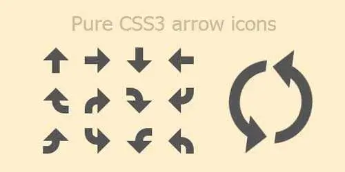
Ok işaretlerini gördüğümde aklıma ilk gelen örnek Fontawesomeydi. Bu örnekte de Fontawesome kullanılmış olabilir diye düşünüyordum. Ama kodları incelediğinizde herhangi bir resim dosyası bulamazsınız. Tamamen Css3 kullanılarak hazırlanmış. Bazı tasarımcılar gördüğünüz gibi Css3 teki yaratıcı yetenekleri sayesinde resim kullanmadan bile çok güzel görüntüler ortaya koyabiliyorlar.
Css de content: ‘ ‘; içeriğini kenarlarındaki (border) çizgilierin şekillerini değiştirerek ortaya bu tür görünüm çıkartmayı başarabiliyorlar. eMaj tarafından hazırlanmış olan bu Demo örneği için birde animasyon bulunuyor. Resmin sağ tarafında birbirini takip edermiş gibi görünen iki ikon sürekli dönüyor. Bunuda websayfanızda sayfa yükleme işlemleri için kullanabilirsiniz.
Kullanım
- Head etiketleri arasına eklemeniz gereken bölüm.
Css :
body {
 padding: 50px 100px;
 background: #FEC;
 color: #CB9;
 font-family: Tahoma,Arial,sans-serif;
}
h1, h2 {
 font-weight: 300;
}
.container {
 width:500px;
 height:200px;
 margin: 0 auto;
}
.arrow {
 width: 40px;
 height: 40px;
 position: relative;
 display: inline-block;
 margin: 10px 10px;
}
.arrow:before, .arrow:after {
 content: '';
 border-color: transparent;
 border-style: solid;
 position: absolute;
}
.arrow .curve {
 position: absolute;
 overflow: hidden;
}
.arrow .curve:before {
 content: '';
 position: absolute;
}
.arrow-up:before {
 border: none;
 background-color: #555555;
 height: 50%;
 width: 30%;
 top: 50%;
 left: 35%;
}
.arrow-up:after {
 left: 0;
 top: -50%;
 border-width: 20px 20px;
 border-bottom-color: #555555;
}
.arrow-right:before {
 border: none;
 background-color: #555555;
 height: 30%;
 width: 50%;
 top: 35%;
 left: 0;
}
.arrow-right:after {
 left: 50%;
 top: 0;
 border-width: 20px 20px;
 border-left-color: #555555;
}
.arrow-down:before {
 border: none;
 background-color: #555555;
 height: 50%;
 width: 30%;
 top: 0;
 left: 35%;
}
.arrow-down:after {
 left: 0;
 top: 50%;
 border-width: 20px 20px;
 border-top-color: #555555;
}
.arrow-left:before {
 border: none;
 background-color: #555555;
 height: 30%;
 width: 50%;
 top: 35%;
 left: 50%;
}
.arrow-left:after {
 left: -50%;
 top: 0;
 border-width: 20px 20px;
 border-right-color: #555555;
}
.arrow-up.curve-right:before {
 border: none;
 width: 0;
 height: 0;
}
.arrow-up.curve-right .curve {
 height: 20px;
 width: 26px;
 top: 20px;
 left: 14px;
}
.arrow-up.curve-right .curve:before {
 -webkit-border-radius: 2000px;
 -moz-border-radius: 2000px;
 -ms-border-radius: 2000px;
 -o-border-radius: 2000px;
 border-radius: 2000px;
 border: 12.01201px solid #555555;
 height: 15.97598px;
 width: 27.97598px;
 top: -20px;
 left: 0;
}
.arrow-right.curve-right:before {
 border: none;
 width: 0;
 height: 0;
}
.arrow-right.curve-right .curve {
 height: 26px;
 width: 20px;
 top: 14px;
 left: 0;
}
.arrow-right.curve-right .curve:before {
 -webkit-border-radius: 2000px;
 -moz-border-radius: 2000px;
 -ms-border-radius: 2000px;
 -o-border-radius: 2000px;
 border-radius: 2000px;
 border: 12.01201px solid #555555;
 height: 27.97598px;
 width: 15.97598px;
 top: 0;
 left: 0;
}
.arrow-down.curve-right:before {
 border: none;
 width: 0;
 height: 0;
}
.arrow-down.curve-right .curve {
 height: 20px;
 width: 26px;
 top: 0;
 left: 0;
}
.arrow-down.curve-right .curve:before {
 -webkit-border-radius: 2000px;
 -moz-border-radius: 2000px;
 -ms-border-radius: 2000px;
 -o-border-radius: 2000px;
 border-radius: 2000px;
 border: 12.01201px solid #555555;
 height: 15.97598px;
 width: 27.97598px;
 top: 0;
 left: -26px;
}
.arrow-left.curve-right:before {
 border: none;
 width: 0;
 height: 0;
}
.arrow-left.curve-right .curve {
 height: 26px;
 width: 20px;
 top: 0;
 left: 20px;
}
.arrow-left.curve-right .curve:before {
 -webkit-border-radius: 2000px;
 -moz-border-radius: 2000px;
 -ms-border-radius: 2000px;
 -o-border-radius: 2000px;
 border-radius: 2000px;
 border: 12.01201px solid #555555;
 height: 27.97598px;
 width: 15.97598px;
 top: -26px;
 left: -20px;
}
.arrow-up.curve-left:before {
 border: none;
 width: 0;
 height: 0;
}
.arrow-up.curve-left .curve {
 height: 20px;
 width: 26px;
 top: 20px;
 left: 0;
}
.arrow-up.curve-left .curve:before {
 -webkit-border-radius: 2000px;
 -moz-border-radius: 2000px;
 -ms-border-radius: 2000px;
 -o-border-radius: 2000px;
 border-radius: 2000px;
 border: 12.01201px solid #555555;
 height: 15.97598px;
 width: 27.97598px;
 top: -20px;
 left: -26px;
}
.arrow-right.curve-left:before {
 border: none;
 width: 0;
 height: 0;
}
.arrow-right.curve-left .curve {
 height: 26px;
 width: 20px;
 top: 0;
 left: 0;
}
.arrow-right.curve-left .curve:before {
 -webkit-border-radius: 2000px;
 -moz-border-radius: 2000px;
 -ms-border-radius: 2000px;
 -o-border-radius: 2000px;
 border-radius: 2000px;
 border: 12.01201px solid #555555;
 height: 27.97598px;
 width: 15.97598px;
 top: -26px;
 left: 0;
}
.arrow-down.curve-left:before {
 border: none;
 width: 0;
 height: 0;
}
.arrow-down.curve-left .curve {
 height: 20px;
 width: 26px;
 top: 0;
 left: 14px;
}
.arrow-down.curve-left .curve:before {
 -webkit-border-radius: 2000px;
 -moz-border-radius: 2000px;
 -ms-border-radius: 2000px;
 -o-border-radius: 2000px;
 border-radius: 2000px;
 border: 12.01201px solid #555555;
 height: 15.97598px;
 width: 27.97598px;
 top: 0;
 left: 0;
}
.arrow-left.curve-left:before {
 border: none;
 width: 0;
 height: 0;
}
.arrow-left.curve-left .curve {
 height: 26px;
 width: 20px;
 top: 14px;
 left: 20px;
}
.arrow-left.curve-left .curve:before {
 -webkit-border-radius: 2000px;
 -moz-border-radius: 2000px;
 -ms-border-radius: 2000px;
 -o-border-radius: 2000px;
 border-radius: 2000px;
 border: 12.01201px solid #555555;
 height: 27.97598px;
 width: 15.97598px;
 top: 0;
 left: -20px;
}
.arrow-animate {
 -webkit-animation: spin 2s infinite linear;
 margin-left: 20px;
 height: 170px;
 width: 170px;
 /*
 i{
 @include border-radius(2000px);
 position: absolute;
 top: $h*.115;
 left:$h*.115;
 width: $w*.57;
 height: $h*.57;
 border:$h*.1 solid rgba(255,0,0,.5);
 z-index: 1000;
 }*/
}
.arrow-animate .arrow-item {
 width: 170px;
 height: 85px;
 position: absolute;
}
.arrow-animate .arrow-item:before {
 content: '';
 height: 0;
 width: 0;
 position: absolute;
 border: 30.6px solid transparent;
}
.arrow-animate .arrow-item .curve {
 height: 71.4px;
 width: 170px;
}
.arrow-animate .arrow-item .curve:before {
 -webkit-border-radius: 2000px;
 -moz-border-radius: 2000px;
 -ms-border-radius: 2000px;
 -o-border-radius: 2000px;
 border-radius: 2000px;
 border: 17px solid #555555;
 height: 96.9px;
 width: 96.9px;
 left: 19.55px;
}
.arrow-animate .arrow-item:first-child {
 top: 0;
 left: 0;
}
.arrow-animate .arrow-item:first-child:before {
 border-top-color: #555555;
 bottom: -30.6px;
}
.arrow-animate .arrow-item:first-child .curve {
 top: 0;
 left: 0;
}
.arrow-animate .arrow-item:first-child .curve:before {
 top: 19.55px;
}
.arrow-animate .arrow-item:last-child {
 top: 85px;
 left: 0;
}
.arrow-animate .arrow-item:last-child:before {
 border-bottom-color: #555555;
 top: -34px;
 right: 0;
}
.arrow-animate .arrow-item:last-child .curve {
 bottom: 0;
 left: 0;
}
.arrow-animate .arrow-item:last-child .curve:before {
 bottom: 19.55px;
}
@-webkit-keyframes spin {
 0% {
 -webkit-transform: rotate(0deg);
 -moz-transform: rotate(0deg);
 -ms-transform: rotate(0deg);
 -o-transform: rotate(0deg);
 transform: rotate(0deg);
 }
100% {
 -webkit-transform: rotate(-360deg);
 -moz-transform: rotate(-360deg);
 -ms-transform: rotate(-360deg);
 -o-transform: rotate(-360deg);
 transform: rotate(-360deg);
 }
}
- Body etiketleri arasına eklemeniz gereken bölüm.
Html :
<div style="float:left">
<span class="arrow arrow-up"></span>
<span class="arrow arrow-right"></span>
<span class="arrow arrow-down"></span>
<span class="arrow arrow-left"></span>
<br>
<span class="arrow arrow-up curve-right"><span class="curve"></span></span>
<span class="arrow arrow-right curve-right"><span class="curve"></span></span>
<span class="arrow arrow-down curve-right"><span class="curve"></span></span>
<span class="arrow arrow-left curve-right"><span class="curve"></span></span>
<br>
<span class="arrow arrow-up curve-left"><span class="curve"></span></span>
<span class="arrow arrow-right curve-left"><span class="curve"></span></span>
<span class="arrow arrow-down curve-left"><span class="curve"></span></span>
<span class="arrow arrow-left curve-left"><span class="curve"></span></span>
</div>
<div style="float:left">
<span class="arrow arrow-animate">
 <span class="arrow-item"><span class="curve"></span></span>
 <i></i>
 <span class="arrow-item"><span class="curve"></span></span>
</span>
</div>